For the Constructing the Visual Narrative class, we're reading Brian Maruca and Jim Rugg's comic Street Angel. Street Angel was chosen because not only is it a wonderfully  entertaining comic but it's a great comic for a young cartoonist to read and see all of the possibilities of the medium. I was able to interview co-writer/artist Jim Rugg. I kept most of my questions to asking about Street Angel, but I did ask about his work at larger publishers and his creative process. I want to once again thank Jim Rugg for taking his time to answer questions for this blog and for the students. Jim Rugg can be found online at http://jimrugg.blogspot.com/All art in this interview is copyright Jim Rugg unless otherwise noted.Comic Connections: Could you talk a little bit about yourself and the comics that you've done besides Street Angel? JIM RUGG: I grew up and live near Pittsburgh. I have a BFA from Indiana University of Pennsylvania (1999) with a major in graphic design and a minor in painting. After college I worked as a graphic designer full time and made comics in my free time – mostly mini-comics. During this time, I met my writing partner, Brian Maruca, at my day job. This led to Street Angel (SLG, 2005). Street Angel led to the PLAIN Janes (DC Comics, 2007) and Janes in Love (2008). The Janes are a young adult graphic novel series I co-created with author Cecil Castellucci. I quit my day job in 2007 and have been supporting myself as a cartoonist/illustrator ever since. During this time I inked American Virgin for DC Comics/Vertigo. I drew a graphic novel called One Model Nation (Image Comics, 2009) for Dandy Warhols’ frontman Courtney Taylor. It’s a historical pop fiction work set in 1970s Berlin about an influential music group and the Baader-Meinhof Gang. Brian Maruca and I collected and created material for an Afrodisiac graphic novel (Adhouse Books, 2009). It is basically an homage to 1970s blaxploitation films and Marvel superhero comics of that era. Recently I illustrated Felicia Day’s Guild comic (Dark Horse Comics, 2010). In addition to that, I try to continue to experiment with stuff like Rambo 3.5 – a mini-comic I did this year as well as contributing to anthologies when possible. I just finished a 10 page strip comic/illustration hybrid for an international fashion bookazine called Circus and I’m currently working on a comic-inspired artwork for a group gallery show this fall. CC: Can you talk a little about your experience as a comics reader? I'm curious what you read when you were younger and how your reading habits evolved over time. RUGG: I didn’t start reading comics until I was 12, which seems to the be the time many kids stopped reading them. I read what I could find on the local newsstands (mostly Marvel/DC stuff) and what I could find at flea markets (occasionally weirder stuff like Grimjack back issues). I enjoyed X-Men early on because I had no idea what was happening. It was so confusing and nothing but subplots. I would read them over and over and over, and it felt like it was a glimpse into this mega-complex huge world. Image came along and I thought I was into indie comics because I read stuff like Deadworld, the Crow, and Faust, then Stray Bullets and Sin City. At the end of college I discovered things like Eightball and Dork and Chris Ware and began reading more comics of that sort. Then around 2000 I attended SPX and started making minis and things just exploded in my head. CC: What kind of formal artistic training have you had? RUGG: Four years at a state university’s small art department. So basically some foundational courses like figure drawing, 2D and 3D design, painting and color theory… NarrativeCC: Can you talk a little bit about the process you go through when you're writing a comic? Do you use a full script or thumbnail out stories? RUGG: I usually write a very tight script – detailed panel breakdowns, dialogue, etc. Then I do very detailed thumbnails. It hasn’t always been that way. With Street Angel (an early work), we did a tight script (lots of revisions and editing), and I drew right from the script. But the more work I’ve done, the more preliminary page layout I do now. In my mind, laying out a page/breaking down a story is really cartooning/storytelling, design, and communication. Then drawing a finished page is illustration/art/drawing, etc. I think the traditional penciler/inker process is not in synch with the way I make comics. In my mind, there is the story (which Brian and I create basically like prose, just a short story). Once we are happy with that, I “translate” it into comics in the form of breaking down the prose into panels, images, dialogue, captioning, and any other narrative device I can think of to create a specific response in the reader (this could be things like page turns, sound effects, repeating imagery, aping a specific drawing style so the reader associates what they are reading with some other common experience, using icons, symbols, lettering style, it’s all available so I try to use whatever I can to create a desired effect). Then we go over this again, either the comic book script or the thumbnails or both. Then I draw it. Lately I’ve been experimenting where some of the choices I make are more ambiguous. Sometimes I don’t know what react these things may elicit. But my opinion of my readers and generally comic book readers in general is high. And readers continue to surprise and impress me with how smart and acute their perception is. So I am trying to experiment a bit more (like in Rambo 3.5), and see how readers react to symbols and drawings that may not have one clear interpretation. CC: You co-wrote Street Angel with Brian Maruca. What is it like writing with a collaborator? What kind of things do you need to consider when you write with Brian? RUGG: Writing with Brian is awesome. I’m extremely critical and tend to work from the right side of my brain (very analytical, organized, planned). He’s extremely critical and favors the left side of his brain (more organic, spontaneous, creative). And his level of critical fervor serves me well. I know if we’re working on a story, I can’t expect him to sign off on some half-ass effort of mine (and vice versa). Sometimes in that way, he’s almost like an editor. The thing is, it’s not easy to find someone who fits my working methods. I have a number of cartoonist friends whose work I admire, but I’d never be able to collaborate with them the way Brian and I work. I admire Brian’s integrity and that allows me a lot of freedom to take chances and trust him when he thinks something works well and when it doesn’t. He’s also very creative and funny, which helps. CC: Street Angel is made up of stand alone stories. Why did you choose to work in a short story format instead of doing a longer work?
  RUGG: My attention span is weak. Also, I never know if something I’m doing will work. So shorter stories allow me to take chances, and if something doesn’t work well, it doesn’t take me three years to realize it. Time is valuable. Also, I have a lot of ideas I want to explore, and working in shorter formats allows me some opportunities to try different things. I learn a lot in short stories (especially with Afrodisiac), that I then apply to future stories. At the time of Street Angel, everyone was falling all over him/herself writing for the “trade.” The result was a lot of Part 4 of 6 issues that sucked. So part of Street Angel’s format was opposition to that trend and the growing pains I saw in it. Finally, I like succinct stories. I enjoy movies, but today’s movies are so poorly edited, like Inception. At 87 minutes, I bet that movie could’ve been a lot of fun. At 2 1/2 hours, it was embarrassing. I found Spike Jonze’s two short films with Kanye West (We Were Once a Fairytale) and that robot love story (I’m Here) were both far more entertaining. Scorsese’s Key To Reserva was incredible, and it was like 9 minutes and change. I could go on and on. In comics especially, many of my favorite stories are short – an issue, a page, 8 pages. I still consider myself a beginning cartoonist, and it’s easier for me to manage 4 pages than it is for me to manage 200 in a graphic novel. And the length of a story does not affect the potential of a story to be good or bad, so the shorter format favors my ability at this time. That said, I do have a graphic novel kicking around my skull. Hopefully I’ll start working on it by the end of this year. CC: What kind of writing and stories influenced the creation of Street Angel? RUGG: Frank Miller (Daredevil, Batman Year One, Dark Knight Returns, Sin City, Elektra Assassin, Hardboiled), Jack Kirby (OMAC, Captain America), Eddie Campbell (King Canute Crowd, Graffiti Kitchen, Bacchus), Paul Pope (THB), Steve Bissette, Erik Larsen (Savage Dragon), Mignola (Hellboy, Screw-On Head), Clowes (Eightball), Chester Brown (Yummy Fur, one of the greatest comic series ever published, possibly THE greatest), Wolverine and the Punisher, Rob Liefeld, David Lapham (Stray Bullets), Heat Vision and Jack, crappy 80s action TV (A-Team, Dukes of Hazzard, Knight Rider), the Monkees (Head). Quentin Tarantino, Martin Scorsese, Wes Anderson. The Texas Chainsaw Massacre. Probably a million other things. CC: How much of yourself are in these characters? RUGG: This is hard to say. On one hand, none of myself, and on the other 100%. I’m really not sure how to answer this one. StorytellingCC: Can you talk a little about the artists that have influenced your storytelling?
  RUGG: [Frank] Miller (on the right, art copyright Marvel Comics)was one of the first cartoonists I followed. I traded a run of Liefeld New Mutants for a Miller Daredevil run when I was 13 or 14, and it was incredible. Miller at his peak was the best mainstream guy at balancing exposition between images and words and only repeating himself for specific effect (like to slow pacing, to draw attention to a specific detail). The Kirby/Stan Lee collaborations are good counterpart to this style of storytelling. Kirby would draw some kind of clear action, and Stan Lee would write dialogue and narration that basically described the action the reader was seeing. Redundant. This can be a desired effect, but in the case of many older comics, it’s a default, rather than a tool in the cartoonist’s arsenal. Miller married his love of noir, clipped writing, like Raymond Chandler with Eisner’s film-influenced ideas of revealing story, plot, and character through action/artwork. Miller did this at an insanely extreme level. Visually, Mazzucchelli was the equivalent of Miller, breaking panels down into abstract silhouettes in order to accelerate the reading pace in action sequences to breakneck speeds then slowing the pace down for visual exposition and atmospheric construction. Further down the line, I think guys like Paul Pope and Dave Lapham and Paul Grist all exhibit some interest in these qualities.
  Jack Kirby (on the left, art copyright Marvel Comics) – visually, his storytelling and three-dimensional approach to the page are still revolutionary. No one has been able to come close to his ability to create 3D, dynamic storytelling on a page. His design sense as well is just mind-blowing. His mature storytelling (1970s) is almost abstract. He created an iconic language of storytelling that is practically its own complete language. As a graphic designer and fan of graphic design, I think his work stands alone within comics for its unique design qualities. Absurdist and genius and beautiful. In many ways, I go from Kirby to Mignola, Larsen, and Pope as guys who incorporate certain qualities of his work that few cartoonists explore. Dan Clowes and Chester Brown (below, art copyright Chester Brown) – I don’t really feel qualified to discuss these guys. They have mastered so many elements of cartooning that it’s hard for me to separate the components of what they do so well. They a
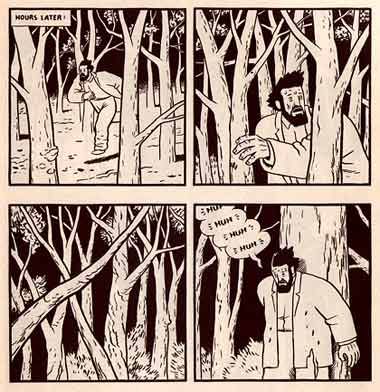 re like surgeons or engineers who use the entirety of the comics language or form to create and build things that wouldn’t otherwise exist. Reading their work is like talking to the smartest person on earth. Every page, every panel is a revelation. Their work is like a magic word to install something in the readers brain, to alter the way a reader sees and interacts with the world. It’s amazing. There are other cartoonists who do this or perhaps have done it with a particular work or two – Crumb, Julie Doucet, Chris Ware, Charles Burns. CC: One of the things I really enjoy about Street Angel are the different storytelling approaches that you use throughout the series. Why did you choose to approach the series like this? RUGG: I love comics as a form, and that form is so vast. In theory, we’ll never explore all of it. So the different storytelling approaches are just examples of me exploring this medium that I love. CC: Do you find yourself experimenting with your visual storytelling with every story you tell? RUGG: To some extent. It depends on the story. Some stories are more about the story, and in that case, I do not want to draw attention away from the story. But in other cases, like genre stories, the whole point of the story is the telling. The story is the least interesting part, it’s the details and style that matter. In that case, my focus is on the storytelling and trying to do something different, surprising, and exciting. I try to keep my reader in mind and to elevate their value, but I think format allows me to experiment with who reads my work. For instance, a little, photocopied mini-comic that I hand sell isn’t going to be read by the same people who read the Plain Janes. So that might be where I experiment more than something that is intended for a wider audience or an audience that may not have a lot of comics reading experience, like fans of the Guild. In that instance, clarity is really important to me. A book like the Guild is going to have a higher percentage of first time comics readers than say, my Cold Heat Special. I want those first time readers to enjoy themselves and to return to the format to try other comics. CC: Something that really sticks out to me is your use of implied storytelling throughout the series, actions taking place inbetween panels, sometimes for comedic effect (the scene where Gary the Ninja kills the henchman in issue #1) and sometimes for more emotional effect (Bald Eagle's dream in issue #3). Why choose to imply these sorts of actions instead of being more explicit about them?
  RUGG: I see comics as a set of instructions, almost a map and data. If done correctly, a reader will read a comic, and it will transfer to his/her brain a unique experience. Some moments lend themselves to this (like Gary having his head cut off in between panels). The juxtaposition of panels is one of the major strengths of comics (another is visual shorthand, like caricature and the use of iconic imagery that acts as a form of written language). When you can use that juxtaposition, I think the comics reading experience is at its strongest. And that may be subjective. This could be a phenomena that I react strongly to, and therefore try to recreate in the comics I make. If you choose to read a comic vs. watching TV, I think the experience of filling in action and information between panels is part of the joy of the medium. CC: How important do you think the grid system is to comics storytelling? RUGG: I think it’s vital. It’s the equivalent of rows of type on a prose page. I used the grid for One Model Nation, and did a series of drawings of pages of different, common grids used on comic pages. It blew my mind wide open. It’s the structure that enables “reading” of comics (and I’m referring the grid as beyond a simple, series of identically sized and shaped panels, but rather the entire structure of the page and how panel readability is reliant on placement and left-right then top-down progression). Working with the grid surprised me. CC: Street Angel takes place in a clearly fictional world but it looks it could be real. What kind of things went into the creation of Wilksborough? RUGG: Drawing and photographing neighborhoods around Pittsburgh. Jasen Lex, an awesome cartoonist (Gypsy Lounge, Aweful Science Fair), and I used to get up early and just walk around different neighborhoods and take photos. It was fun. CC: How much of the environment that you grew up in or your around on a daily basis influenced the creation of the world Street Angel takes place? RUGG: None. I grew up in a rural environment surrounded by mountains, farms, and woods. If it influenced Street Angel’s world, it was in an opposite manner. Like I wanted to create something that was different than what I was used to seeing. It could’ve been a reaction against the “write what you know” thing. I had done a series of autobiographical stories and wanted to do something else.
Craft
CC: Can you talk a little about the tools that you use to make comics? Do you switch tools occasionally or do you stick with what works?
RUGG: I have tools I like – sable hair brushes, Hunt 102 pen nibs, but these days, when anything that makes a mark can be reproduced very well, it seems silly to fixate on specific tools. A lot of my comics are about comics, as such, using traditional tools is necessary to maintain a certain level of fidelity to the material that my work references or conjures.
I spent a lot of time talking to pros and reading interviews w ith cartoonists to learn what tools they used. In my head, it was like I was searching for some magic pen that would allow me to draw like Al Williamson. Eventually, I wrote to Dave Cooper about his lettering and what tool he used. He sent me a very nice email that explained he used a Hunt 102 for just about everything – drawing, lettering, you name it. If you’ve ever used a Hunt 102, you know that beautiful lettering like Dave Cooper’s shouldn’t be possible with that tool. I gave up searching for the magic pen after that email. It’s not the tool, it’s the craftsman.
CC: How much planning goes into your individual pages? Do you do full pencils or very loose ones?
RUGG: A lot of planning goes into most of my pages. I usually draw very rough, nearly incomprehensible roughs, then I do a detailed thumbnail at about 50% of the printed or final page size, then I do pencils (their level of tightness varies depending on deadlines, whether I’m inking it myself, if an editor needs to sign off on it, etc.). The complexity of the drawing and subject also affects the detail of the pencils. If I’m drawing a complex bit of architecture or a specific person’s likeness, I’ll usually do more detail.
CC: This isn't related to Street Angel but I am curious about the experience that you had inking on American Virgin. You were working over another artist's pencil work, in this case Becky Cloonan's pencils. Can you talk a little about that experience and the difference in inking pencils that aren't your own?
RUGG: Working on Becky’s pencils was awesome. I think my inking style fit her pencils well. I used a lot of brush on her pages. She spots blacks very well.
 I wouldn’t mind doing more inking. I love a lot of inkers, particularly some of the older guys who have distinct styles – Tom Palmer, Klaus Janson, Al Williamson, Dan Green, Joe Sinnott, Mike Royer, Kevin Nowlan, Bill Sienkiewicz. The inkers I like are guys who tend to finish the art, not just trace lines. I don’t have the confidence to do that. I tried to stay as true to Becky’s line as possible. The role of the inker is so different now. In most cases, they aren’t important any more. They used to define volume, texture, lighting, and depth. Now all of that is done by the colorist. In order to reproduce the artwork in the past, the high-contrast of ink on white paper was necessary. It isn’t anymore. So I think the inker is a nostalgic part of the process, which saddens me because I love the way that work looks. It’s strange to see comics cross over from a commercial medium to an expressive one.
CC: I remember you saying that you graduated with a graphic design degree. How much of that plays into your use of typography in your work?
RUGG: I can’t say. I love lettering and typography, but I consider myself less than an amateur when it comes to that subject. I want my lettering to be good, but I’m not sure what I’m doing with it. Most of my lettering is based on intuition, rather than knowledge.
It bothers me that some people completely devalue lettering, including Marvel and DC. I suppose it’s still a commercial product for them, so computer lettering is the cheapest. I think it’s a shortsighted business practice to disregard the one element of a comic that every reader sees. In terms of artwork, readers look at art differently, some breeze past it, barely acknowledging its existence. They look just long enough to interpret the information and onto the next panel, others may linger longer on a particular panel or image. But if some actually reads a comic, they definitely look at the lettering. So the most widely read/seen component of a comic book is usually the most cheaply produced.
Don’t get me wrong. I’m not against mechanical lettering. But it shouldn’t be the default. It should be a choice the cartoonist makes because he/she thinks it best serves the work and the reader and the cartoonist’s intentions.
CC: Alot of Street Angel, particularly the covers, you do different sorts of lettering. How much of that is done by hand and how much is done with a computer, if any? If you do use a computer, which programs do you use?
RUGG: I do both computer and hand-lettering. I’ve used 3D software (Street Angel #1’s cover title lettering), vector, and raster software (primarily Illustrator and Photoshop, but also Quark Xpress and InDesign). I’ve scanned found lettering. I hand letter with Ames lettering guides, French curves, whatever I think will work. I had my wife hand letter a note for a panel once.
Print
CC: Can you talk a little about the different kinds of experiences you've had working on books at smaller publishers like Adhouse and Slave Labor versus the kind you've had working for larger publishers like Dark Horse and Marvel?
RUGG: I would say editorial, marketing, money, and IP ownership were the big differences. With smaller publishers, specifically my experience with Street Angel (SLG) and Afrodisiac (Adhous e), we basically created the comics, then showed them to the publisher and the publisher decided to publish them or not. The publisher gave us a little feedback, but there were no major changes requested or content limitations imposed (though neither of those books is pushing the limit of decency so…again, these are my experiences, and certainly other people’s experiences will differ). In terms of marketing, we handled a lot of that effort on our own. Both SLG and Adhouse did some effective things to help sell our work (SLG overprinted and over shipped copies of Street Angel #1, the result was sales didn’t dip between issue 1 and issue 2, which is amazing; both SLG and Adhouse have lists of reviewers and press people that they sent review copies to), but they also encouraged Brian and me to do anything we wanted, like art contests, tons of interviews, a little advertising here and there, shows, etc.
With Marvel, DC, and Dark Horse, they provide a lot of editorial supervision. Sometimes this means revisions; other times it just means talking with an editor regularly. They also handle more of the marketing, referring interviewers to creators, setting up tradeshow appearances and schedules, sending out preview and review copies, advertising, etc. Financially, the bigger publishers all provide a page rate (money for work completed as the work is completed, usually broken down into a page rate). With Street Angel and Afrodisiac, we did not receive money up front, our payment was based on a royalty system – for each copy sold, we received a certain amount of money. The bigger companies also have royalty systems, but that is in addition to page rates or advances (money paid before the book is published, and then deducted from royalties until it is recouped by the publisher).
Finally, IP ownership varies. For Street Angel and Afrodisiac we own the intellectual property and retain all licensing rights. This arrangement varies with different companies, characters, and books.
CC: What kind of things do you consider when you're sending a book to print?
RUGG: Sending one to print? At that point, I’m just worrying about technical specs – resolution, bleed, dot gain, that sort of thing. Before we decide to do a book, we consider potential audience, does the subject and quality of the book warrant the price tag of the book. For instance, Afrodisiac is $15. Compared to other comics that cost $15, I think it is reasonable. But Rambo 3.5 would not be worth that. It’s a little art experiment. So as a mini-comic (something I photocopy and sell for $2 at shows, not through Diamond), it doesn’t require a fan of my work to take a chance on something a little different and perhaps be disappointed. Does that make sense? The cost of a book is not arbitrary, it’s based on the cost to produce the book – printing, shipping. Cost and potential audience is something I consider when putting a book together. To help figure this out, I rely on the publisher that I’m working with because they have done this hundred, even thousands of times. So they are a great resource.
CC: Let me clarify that last question. When you're drawing comics, what kind of considerations do you make with storytelling choices in regards to when it's going to print? I'm thinking of things like double page spreads, reveals on succeeding pages, etc.
RUGG: I spend a lot of time thinking of page layout, how directional devices work between panels (for instance, if a character's eyes are looking to the right, and the next panel is that direction), how pages and spreads end. There is a bigger gap in a 2 page spread between the last panel of the left page and the first panel of the right page. That larger gap represents a potential speed bump in the reading experience, so a scene shift or some other natural break in timing can fit nicely there to avoid disrupting the reading experience. For a right hand page, it's a natural point for a cliff hanger. For instance, in my Afrodisiac story, Night of the Giant Cockroach, the second page ends with a car racing from left to right (i.e. the end of the page). To further this effect visually, the vanishing point is on the right, so all of the parallel lines are converging like an arrow point to the edge of the page. On the fourth page of this story, the car enters the panel (via motion lines) at the bottom left (the story was originally designed as 4 oversized pages for an anthology). So in this case, as you are reading the left page and you come to it's end, the next page picks up at the bottom of the page, you just read across the spread, and follow the car/action up the page as it hits the monster's face (at the top of the panel).
So yeah, I'm very conscious of page design/layout, and it's something I think about a lot right now because I believe format is dead. People are choosing where and how to read comics now. It's no longer up to the publisher or artist how someone reads the material. Whether the work is officially released digitally or bootlegged, it's no longer the exclusive control of the creator. As such, page breaks, page layouts, etc. are more arbitrary than before. How this will be handled by cartoonists...don't know, but it is something I think about and watch.
CC: One last question. What kind of advice can you give to cartoonist starting out?
RUGG: Don’t expect to make money from your art. If you want to be a commercial cartoonist, that is one thing. But if you want to make personal, expressive work maintain a day job. Many of my favorite comics were created by people who made little or no money from them. Financial gain is not a measure of a work’s quality. Conversely, your work will not sell itself, no matter how great it is. If you’re concerned with sales, you have to learn how to sale your work. This is a skill set, one that can be researched and developed.
Develop a support group – one for your personal life and one for your professional life. Cartooning is a passion for most cartoonists, as such, it’s easy to fall into a lifestyle of nothing but cartooning. This isn’t healthy. Develop other areas of your life (and for the workaholics, don’t worry, life lessons can always be applied to your work, so even while you’re not making comics, you will be improving as a cartoonist). Draw everything, all the time. Exercise and eat well. Stamina is vital for a cartoonist. It’s hard, demanding work, the stronger you are, the better cartoonist you’ll be.
Learn to live on as little money as possible. This will translate into greater creative freedom. Save money whenever you can because there will be dry stretches.
When you have questions, ask. Most cartoonists I’ve approached have been very generous with their knowledge and time.
Do not judge your readers. If someone reads your work and sees it differently than you want, that’s okay. Art is like a mirror. Each of your readers will bring different experience to your work, and will therefore see your work differently. That’s actually a good thing.
There are a lot of emotional highs and lows in the creative process. Don’t be freaked out by these extreme mood swings. It’s natural and common. Take a walk when you need a break. 

 Cover by Chrissie Zullo from Cinderella; From Fabletown with Love


